Creative Direction
Art Direction
Graphic Design
Digital Artwork
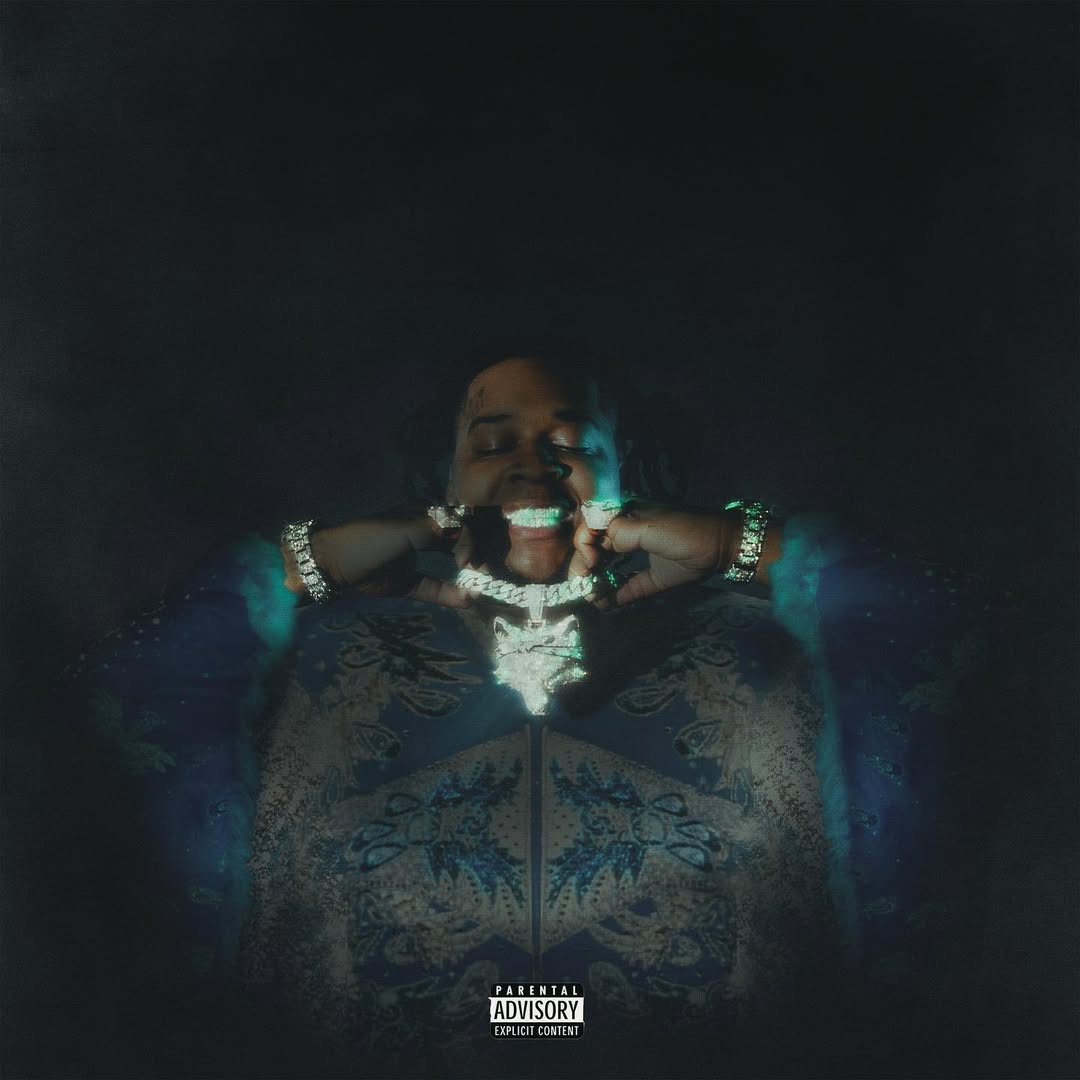
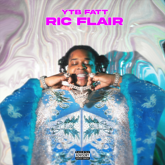
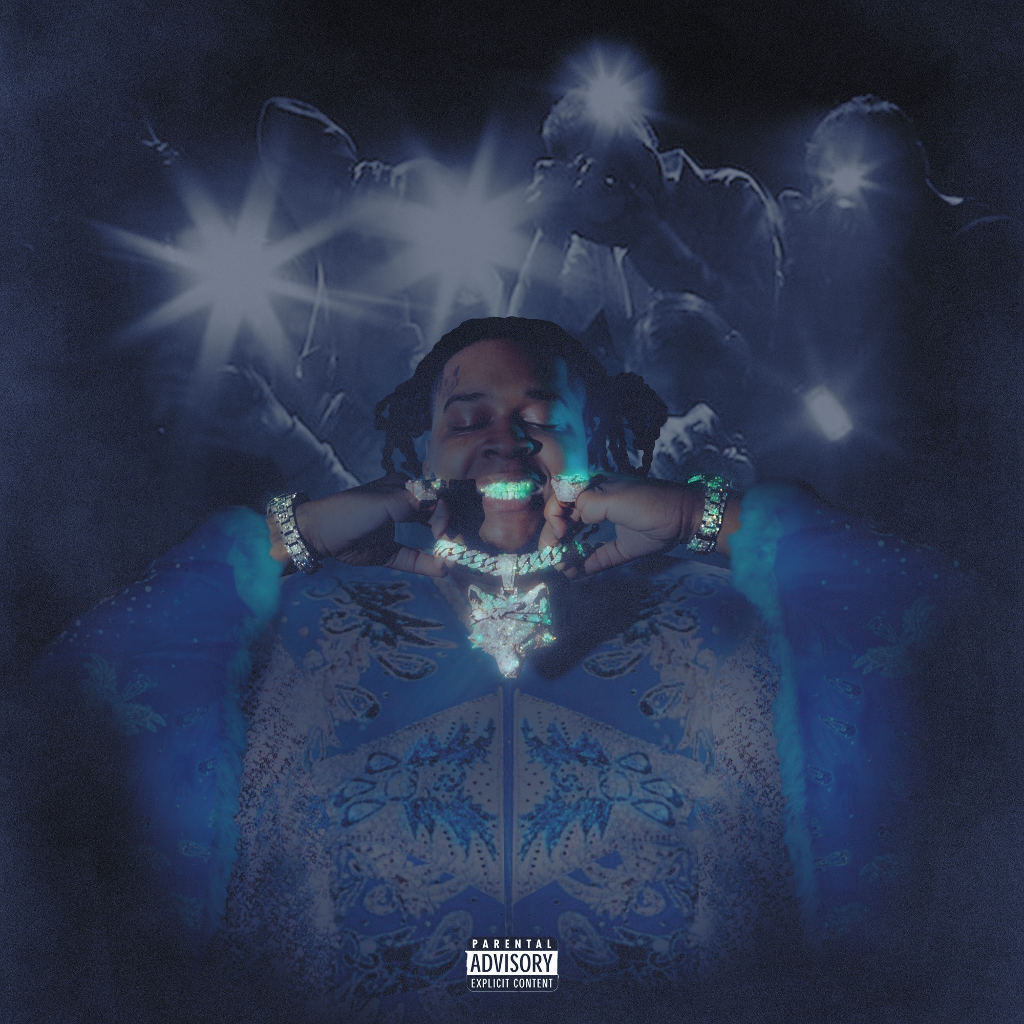
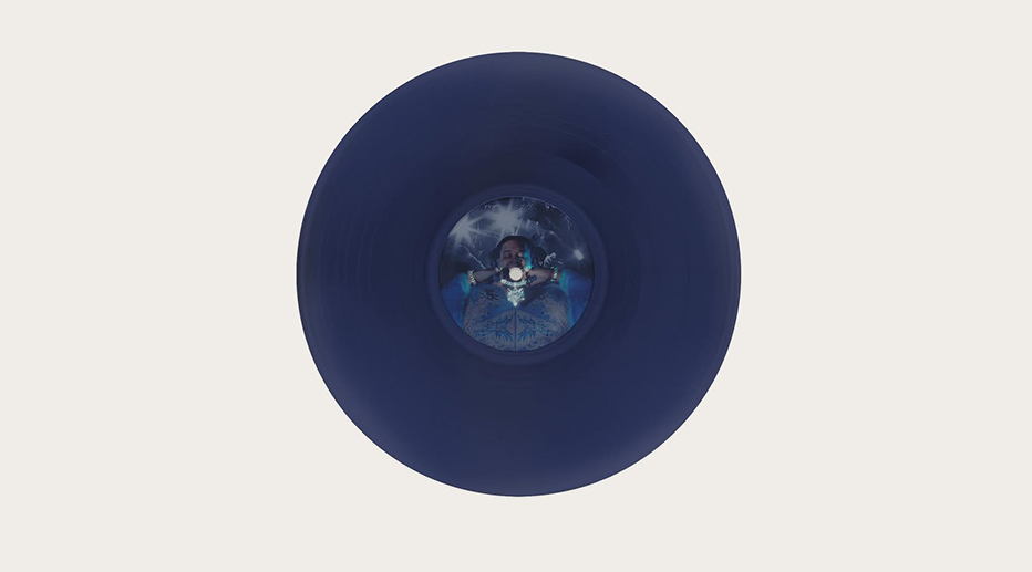
I looked at the guidelines given for this release, from one of the senior designers at 10K Projects, and executed my best outcome of the idea that was presented, ideally having the artist YTB FATT, in an outfit / Robe iconically worn by Ric Flair matching the track title perfectly.
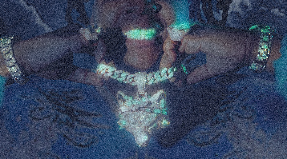
The challenges of this specific project were strongly connected around image manipulation, shading / blending, and texture. I started with the direction given, involving sourcing multiple images, from screenshots, video footage, and manipulating them using mostly perspective and warping tools, seeing the very strong blue tone on the costume in mind I knew I wanted to make sure this was resembled in the final cover, so i meticulously started with the arms of the costume as this is where a key focal point would have been with the artist’s jewellery etc. I then worked on shadows and blending, shading the artificial costume, highlights, making the jewellery shine in certain areas, and finally I worked on texture, one of my strong points and something I personally think just adds a lot of depth to anything you’re creating. tone I knew I wanted to implement, after this it was a lot of colour adjustment, painting shadows, highlights, plotting shading, and where the actual campaign material would have a dream like effect of glow.
Creative Direction
Art Direction
Branding
Graphic Design
I looked at the guidelines given for this release, from one of the senior designers at 10K Projects, and executed my best outcome of the idea that was presented, ideally having the artist YTB FATT, in an outfit / Robe iconically worn by Ric Flair matching the track title perfectly.
The challenges of this specific project were strongly connected around image manipulation, shading / blending, and texture. I started with the direction given, involving sourcing multiple images, from screenshots, video footage, and manipulating them using mostly perspective and warping tools, seeing the very strong blue tone on the costume in mind I knew I wanted to make sure this was resembled in the final cover, so i meticulously started with the arms of the costume as this is where a key focal point would have been with the artist’s jewellery etc. I then worked on shadows and blending, shading the artificial costume, highlights, making the jewellery shine in certain areas, and finally I worked on texture, one of my strong points and something I personally think just adds a lot of depth to anything you’re creating. tone I knew I wanted to implement, after this it was a lot of colour adjustment, painting shadows, highlights, plotting shading, and where the actual campaign material would have a dream like effect of glow.

.webp)